Here we take another crack at understanding whether pressure plays a role in a golfer’s performance on the PGA Tour.
First, we make the usual adjustments to scores; course difficulty and field strength are taken into account to create a strokes-gained measure for each round played. This measure tells us how much better a player’s score was than the average score shot on a neutral course that year on Tour. Second, we calculate each player’s “pressure-free” strokes-gained average; this is done by averaging all their adjusted scores in first and second rounds throughout a given year.
We want to look at how players perform in the 4th round relative to their “pressure-free” averages. We refer to the difference between a player’s 4th round score and their average as “personal strokes-gained”.
Before digging into the data, let’s briefly consider what we should expect to find. First, note that, by construction, the average personal strokes-gained over all players will be zero in the 4th round; this is because strokes-gained is a relative measure, and as such if every player truly did play worse (or better) than normal in the final round, we could not (from looking at the data) distinguish that from say, courses just playing more difficult (or easier) in the final round.
Anyways, don’t dwell on that point if it doesn’t quite make sense. What we want to look at is whether players perform worse when they are closer to the lead heading into the final round, as this is where we think players are feeling pressure most. However, there are 2 basic mechanisms that could result in scoring averages being different when near the lead: 1) In general, players near the lead in a final round of a tournament are playing well – and because form carries over slightly from round-to-round, we could perhaps expect them to continue to play well in the final round, and 2) As previously mentioned, there is pressure on players to perform well when they are in contention and have a lot of money and points on the line. The former would cause a player’s scores to be better than normal when near the lead, while the latter would cause them to be worse.
Ok, we still haven’t got to any data yet, sorry. Below we plot the fitted values (i.e. the conditional mean) from a regression of personal strokes-gained on a player’s position heading into the final round. (In lay terms, we are just drawing a line, or a polynomial, that best fits the data). We fit a quadratic function here. We are using 2011-2016 PGA Tour data, and include all players who had at minimum 20 1st & 2nd rounds in a given year.
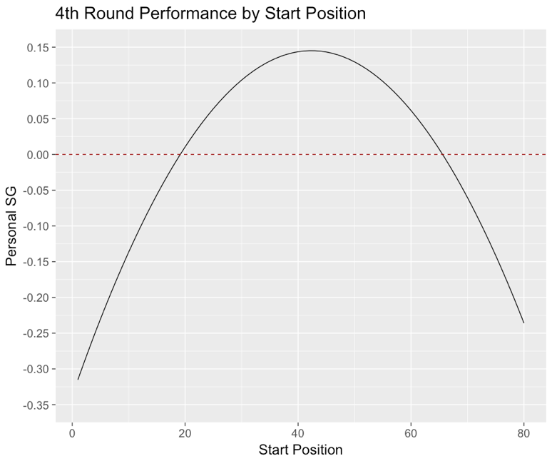
This is interesting. It says that, on average, a player plays worse than their typical performance level when he is near the lead, or when he is near the back of the pack, heading into the final round. We can think of a story to fit this nicely; players in contention feel some pressure and this causes their performances to suffer, while those at the bottom of the leaderboard heading into Sunday are simply not playing well.
Now, anyone familiar with golf data knows that most of the variation in golf scores is not predictable (i.e. most is day-to-day random variation). Therefore, it is reasonable to think that we are trying to tell a nice story about pure noise here. For that reason, I fit the same quadratic function for each year from 2011-2016. Here are the plots:
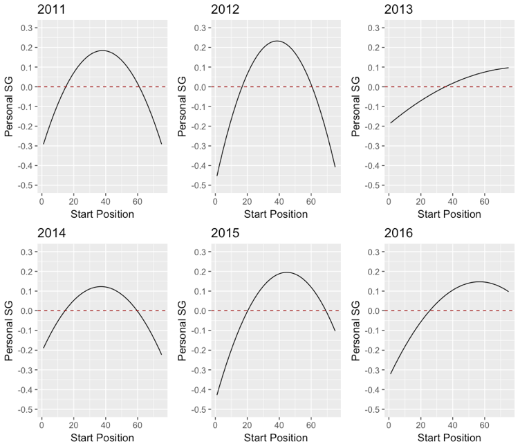
While the pattern varies a bit from year-to-year, one thing that we always see is a drop in performance when a player is inside the top 20 or so at the start of the final round. This is reassuring, as it is evidence that the observed relationship is not just an artifact of a specific sample. Another issue one could bring up is why I am fitting a quadratic function, as opposed to some higher-order polynomial; here is the cubic for 2011-2016:
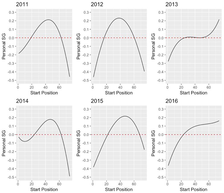
Again, the pattern varies a bit, but we still see this general tendency of players to play worse than usual near the lead! I am reasonably convinced by these patterns, mostly because it is fairly robust across years. Of course, as mentioned earlier, there is lots of variation in the scores shot from any starting position heading into the final round; some players shoot great scores when near the lead, while others have shot great rounds in last place, and vice versa. But, these graphs do show that, on average, there appears be a relationship between a player’s starting position in the final round and his subsequent performance.
Okay, moving on for those still with me. I next do the same analysis, but for strokes-gained putting, and strokes-gained tee-to-green. That is, we are comparing how players’ are performing relative to their “pressure-free” averages from round 1&2 in putting and tee-to-green play. Here is the graph using quadratic fits for all data from 2011-2016:
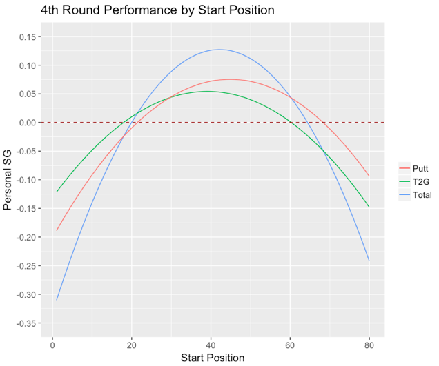
Again, this is interesting. But, again, these results should be interpreted cautiously. What this fitted plot shows is that putting appears to contribute more than tee-to-green play to the deterioration in a player’s performance when starting the final round near the lead. This is perhaps surprising due to the fact that players hit more shots tee-to-green in a typical round than they putt, which would (all else equal) tend to result in tee-to-green play contributing more to total score. These plots are fairly robust when fitted to each year of data, but I would still hesitate to give them a stamp of approval, as the data we are fitting is very noisy.
Next, I do a comparison of elite (defined as a player with annual SG average > 2) versus non-elite players:
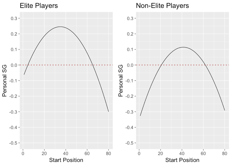
Not too much to say here, this is as you would expect; elite players appear to have less of a drop (or none at all) in performance (relative to their round 1&2 average) when they are near the lead as compared to non-elite players.
Finally, let’s look at the fitted plots of some specific players (again using final round data from 2011-2016):
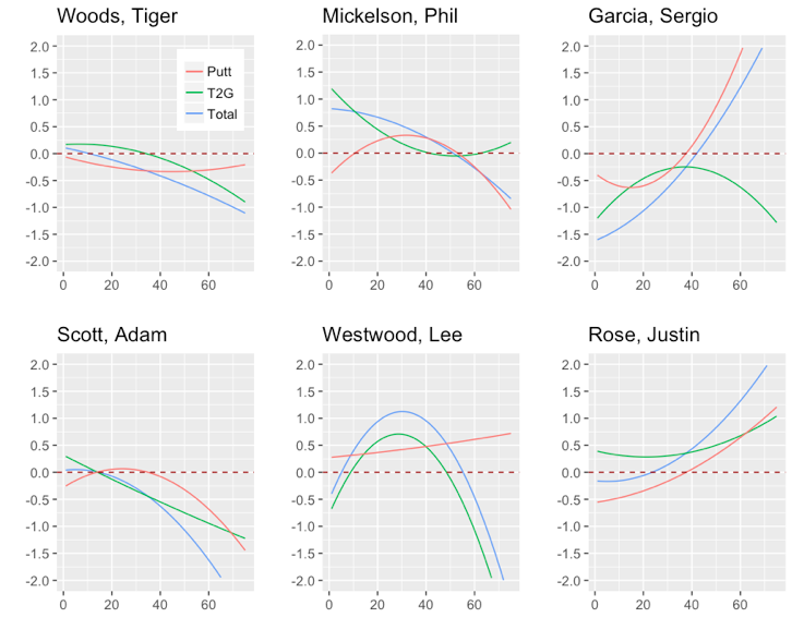
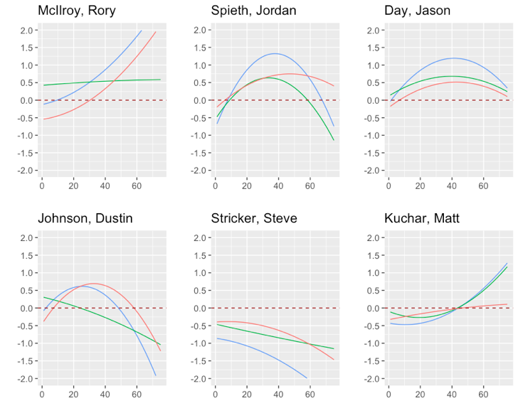
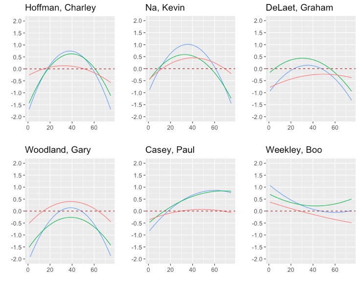
Note that for an individual player, they can have a non-zero average personal strokes-gained for their final round play (look at Stricker, for example). This means that the player is on average playing worse relative to his round 1&2 standard in final rounds, irrespective of his starting position. The sample size for these plots ranges from 40 (Tiger) to 126 (Kuchar); so not huge but not tiny either. It is interesting to look at Garcia’s plot; he has gotten a lot of grief for not finishing tournaments off, and this would seem to indicate that the criticism is justified. Rory’s plot also makes a good deal of sense; he seems to have a lot of back door top 10 finishes, which requires putting up good rounds from a long way back on Sundays. Finally, Hoffman and Woodland are both players who I’ve always thought were shaky in final rounds, and their plots seem to bear this out.
To wrap things up, the main takeaway here is that players do seem to play worse when they are near the lead heading into Sundays on the PGA Tour. Averaging across all players, we find that players play approximately 0.3-0.4 strokes worse than their typical level of play when near the lead. While we can’t say whether or not this is due only to pressure per say, the argument could be made that this is a lower bound to the effects of pressure on performance. As mentioned earlier, players who are near the lead heading into the final round are playing well that week (with the exception of “old” Tiger, maybe), and so the fact that we observe a drop in performance suggests that the detrimental effects of pressure more than offset any carryover in good form from previous rounds in the tournament. By this logic, 0.3-0.4 strokes could be a conservative estimate for the effects of pressure on performance.

Very interesting! I wonder if each golfer could predict/describe what their plot would look like?
Yeah, I’m not sure that a player could recognize it (assuming these results aren’t flawed, and there actually is something there!). Because pressure explains so little of the total variation in a player’s score it would be hard to notice. But, I’m sure players like Garcia are aware they have tended to play worse near the lead !