The pressure of playing with the lead is something that is brought up often during the telecasts of golf tournaments, specifically in the majors (golf’s 4 biggest tournaments). Golf commentators, specifically those who are former players (cough…Azinger…Miller..cough), love to point out when players are “choking” under the pressure of trying to win golf tournaments. But is it really the case that golfers perform worse “under pressure”? Often times, we see an unknown golfer take the lead into the final round of a big tournament, but then he fades out of contention. The golf pundits will say that the moment was just too big for him – the pressure cracked him. But, there is a reason this golfer hasn’t been in contention before; he isn’t that good. Therefore, we shouldn’t expect him to play as good as the best players on any day, irrespective of the so-called pressure of the situation. This is just a quick thought that sheds some light on the difficulty of identifying the effects of pressure on golfers’ performance. Anyways, let’s head to the data to see what can be said about performing under pressure in golf.
The first issue to address is what should be used as a measure of pressure. The second issue is what should we look at to assess golfer performance (I have access to a mountain of PGA Tour ShotLink data, so analyses can be done at the stroke or round level). I am going to consider any player in the top 3 (including ties) heading into the final round as “playing under pressure”. The outcome of interest will be the 4th round score. There are plenty of reasons to complain about these two choices I made, not least of which is that they are completely arbitrary. However, they will have to do for now. I am using ShotLink data on all PGA Tour (excluding the WGC match play) tournaments from 2012 to the current date. As a first pass, let’s simply compare the 4th round scoring average of those players in the top 3 plus ties, to the rest of the field. For this, for each 4th round in tournaments from 2012-2016, I calculate the difference between the average score of players inside the top 3 and those outside the top 3. I then take the mean of these differences – and obtain a value of -0.27. This means that on average over the last 5 years, players in the top 3 heading into the final round have actually performed better than those outside of the top 3. Wow! So much for the negative effects of pressure! Not so fast…..
You probably have several objections to this naive analysis. It is obviously the case that the best players are in the top 3 more often than the lesser players. It is probably not fair to compare the scores of Jordan Speith (who is often in the top 3) to Ben Crane (who is often not in the top 3). We would like to compare the scores of a player under pressure conditions (inside top 3) to this same player under non-pressure conditions (outside top 3). That is, we will only compare the final round scores of under-pressure Speith to non-pressure Speith, and under-pressure Crane to non-pressure Crane. Let’s do this.
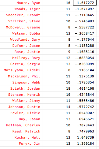
First, for every tournament in the data, I difference every player’s 4th round score relative to the field average that day – this corrects for the overall playing conditions on a given day. Second, for each player, I calculate their average score (relative to the field) when they are under pressure (inside top 3 going into 4th round) and when they are not. So, for example, Ryan Moore’s average score relative to the field when not under pressure is 0.195 (i.e. he loses to the field by 0.195 shots) and when he is under pressure his average relative score is -1.422 (i.e. he beats the field by 1.422 shots). The numbers on the right below are the difference between the player’s performance under pressure and not under pressure. I will just call this the “performance under pressure measure” from now on. So Ryan Moore is the best (somewhat shockingly), and Jimbo is the worst (not surprising) under pressure, as I have defined it. Also, the number in the middle indicates how many times a player has been under pressure in the last 5 years. I only look at those with at least 8 pressure situations because the sample size needs to be somewhat large to obtain a reliable result for a player. For example, Smylie Kaufman was only under pressure once, and it was at the Masters this year where he shot 81 on Sunday – so his number on this table would be greater than 9 and is probably not informative about his actual ability under pressure.

So this can be thought of as a player-specific measure of performance when in contention. The issue that I mentioned earlier in my first analysis is now taken care of – I am only comparing a player to himself in the two pressure states (inside top 3 or not).
To get a sense of whether or not, overall, players play better or worse under pressure, I take the average of all the performance under pressure measures – and obtain a value of 0.129. This average included 224 players – to be included in the sample you had to get into contention (top 3) at least once or else I would not be able to calculate the pressure measure. I also calculate a weighted average, where the weights are equal to the number of times a player has been under pressure (the middle number above in the table) and get a similar value of 0.114. This positive number indicates that players, on average, perform slightly worse under pressure compared to their usual level of play (all of this again, is relative to the field on a given day).
This analysis is still far from perfect. One objection would be that when Jordan Speith is inside the top 3 going into Sunday, he is playing well that week, while when he is outside the top 3 he is likely having an off week. Thus, to compare his relative-to-the-field scores in these two situations would reflect not only differences in pressure, but also differences in his average level of play in the two situations. But! This argument would lead us to underestimate the effects of pressure because when a player is under pressure it means they are playing well, and there scoring average should be lower all things equal (including pressure). So the estimate of a 0.114 higher average score relative to field when a player is inside the top 3 versus not, may reflect a combination of having an overall better week when inside the top 3 (which will cause the player to shoot lower scores relative to the average) AND the effects of pressure. So, our real estimate of the average performance under pressure measure may be biased downwards – pressure actually causes players to play worse than 0.114 relative-to-field shots compared to their usual non-pressure playing environment.
I’m getting tired, so to wrap things up, it appears we may have to keep listening to J-Miller and Azinger go on about the pressure of the big golf events – as the data supports their claims.

Wouldn’t another ‘correction’ be appropriate? Tiger had a substantial average SG advantage over the field in each round when he was playing his best. Would it be more informative to see the difference over the field in contention vs. their regular difference over the field?
I have made that correction already. I am comparing the player’s typical score against the field to their score against the field when in contention. It should be clear from the description of Ryan Moore’s example calculation.