It has never been easier to access and analyze PGA Tour golf stats. BUT, despite the abundance of stroke play data, there is no data readily available for match play analysis. Considering all the analysis that goes into the Ryder Cup, Presidents Cup, and WGC Match Play, there should at least be SOMEBODY out there analyzing some real data, instead of Brandel just saying that Jimmy Walker will win a match because he rotates through the ball well (even though he does). My discontent was so strong that I have actually taken the time to develop a web scraping script that extracts useful information on Match Play data back to 2008. The match play data is pulled off of golfchannel.com, and the relevant player data (strokes gained, world rank) is taken off of pgatour.com.
In the end I was able to assemble my own dataset by using a various number of data structures throughout the process. If your interested, I used the Beautiful Soup, pandas, and numPy libraries in Python. I have also attached all the code right here in zip file:
Python Scripts: Match_Play_Code
I was able to scrape the following information off of the internet using the above script for every match played from 2008 to 2016 at the WGC Match Play.
- year match took place
- name of each player involved in match
- nationality of each player involved
- world ranking of each player
- strokes gained putting for each player at time of match
- strokes gained driving for each player at time of match
- and of course, who won the matchOkay, so finally we have some data that may give us some new insights on the mysterious world of match play.
DATA VISUALIZATION
The rest of this post is going to introduce us visually to the never-viewed Match Play Data.
So let’s get into it. First off, I am going to take a deeper look at Strokes Gained and see if it plays a role in predicting who will win the match. More interestingly, what do you think will be the stronger predictor, strokes gained putting, or strokes gained driving? I think it will be driving, just because I don’t know how you can play against a guy like DJ hitting it 350 down the middle every hole and not get demoralized, even if your Jordan Spieth.
Below, I have created a figure that shows the difference between strokes gained putting on the x-axis, and the difference between strokes gained driving on the y-axis, each point corresponding to a specific match. A red x indicates a match that was lost by the player whose stats were being subtracted from. A green circle, as you probably guessed, means that the player whose perspective the axis are from, won the match. I also quickly did a logistic regression, and plotted the linear decision boundary on the plot. A point that lies on the decision boundary is classified as a “toss-up” by the algorithm, meaning that there is a 50% chance either player wins. Points above are predicted to be ‘wins,’ while points below the line are predicted ‘losses.’
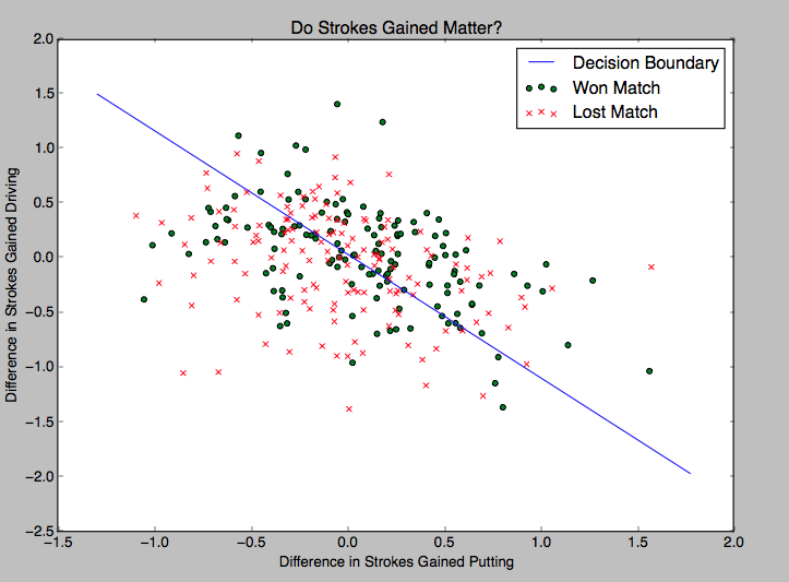
We do see that strokes gained (putting or driving) is associated with winning. There are a lot more green dots than red in the top right of the figure, and more red crosses than green in the bottom left. The decision boundary matches our intuition nicely. Our algorithm predicts that if a player has a higher strokes gained putting and strokes gained driving (or any combination that lands itself above the blue line), he is most likely to win the match. But which one is more associated with winning? Driving or putting? Well, the slope of the decision boundary is about -1.2. Suggesting that Strokes Gained Putting is slightly more important in deciding the outcome of the match. The idea being that a completely vertical line would indicate that only putting decides the outcome. Of course this is a backhanded analysis, but it will have to suffice.
Okay so strokes gained looks like it is a decent candidate for being a predictor, however World Rank is the one I think I would ultimately trust if I had to bet on a match. So below, I tried to visually assess if win probability is an increasing function of how far ahead you are in the OWGR (Official World Golf Ranking). So I divided the difference in world rankings in each match into various bins, which are on the x-axis. The height of each bar tells you what percentage of the time the higher ranked player won the match for that bin. For example, in matches where the world ranking separation was between 0 and 4 (first bin), the higher ranked player won 49% of the time. When the ranking difference was between 50 and 54, the higher ranked player won 71% of the time.
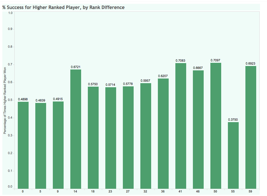
Another way of thinking of this is the percentage of time that basing a prediction solely on world ranking points will give you the accurate prediction.
There is an upward trend in the data. As the difference in world rankings becomes larger, the percentage of time the higher ranked player wins also increases (usually). The exception is clearly the second last bin (please contact me if you can give me a reason). In case you are wondering, all of these bins have a sufficiently large and consistent amount of data. Despite the increasing trend, being over 60 world ranking positions ahead of someone only gives you a 70% chance of winning. Given that a 1 seed has never lost in NCAA Tournament, golf is looking pretty random. A more interactive version of this figure is located at this link.
Moving on…
Since this is a Match Play analysis, we need to at least address the Ryder Cup. We all know that the Europeans are “great” match play players, so they say. To shoot this idea down I just quickly looked at the track record of USA vs EUROPE from the past 8 years to see if this perception holds true in the WGC too.
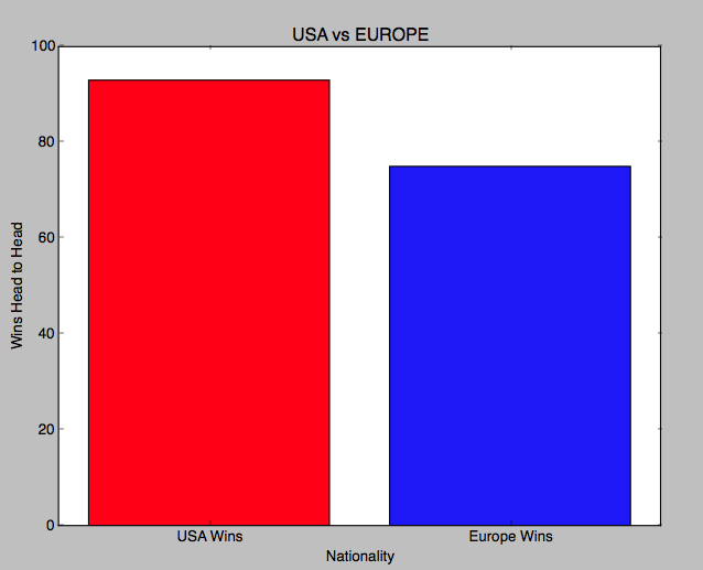
Well there you have it. This only leaves two possibilities
- The Ryder Cup is random,
- or the Euros are only good at ‘team’ match play and/or the US especially suck at team match play. (Tiger and Phil…)
Okay, so last thing we are going to look at is simply who is the BEST match play player over the past 8 years. The figure below simply plots wins against losses. Only players who have completed at least 5 matches were included. Some of the points are labelled, to get interactive version click on this link!
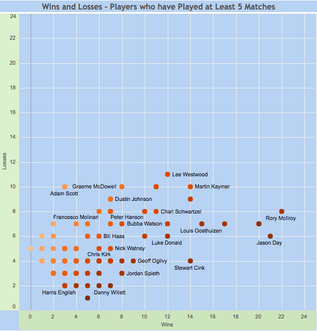
As expected, we see the top guys fairly low and to the right, indicating lots of wins relative to losses (the darker the dot, the higher the win percentage). Some notables:
- Rory McIlroy –> 22 – 8
- Jason Day –> 21 – 6
- Adam Scott –> 3 – 10 WOW!!
- Jordan Spieth –> 8 – 3
- Dustin Johnson –> 8 – 10
- Rickie Fowler –> 10 – 6
- Bubba Watson –> 12 – 7 *I thought he was “too nice” for match play*
Again, hit this link if you want to explore the data yourself. I really recommend it.
PREDICTIVE ANALYSIS
I did actually cut the data in half and trained a full (using all features) logistic regression on the data and tried to predict out of sample. The model managed to predict the outcomes of 60% of the matches correctly. Over 18 holes of golf I’m not sure it is possible to do much better without monitoring closely how well a player is playing leading into the event…hm.

Curious about why you looked only at driving and putting when SG analysis indicates that total long game tends to be more important in stroke play? Do you have an indication that these skills are more important in the more ‘binary’ format of match play?
Good point, to be honest I just thought that those two were the most interesting (could only include 2 due to the nature of that visualization). However you are correct, we are currently working on creating a predictive model that predicts outcomes of golf tournaments based on all the data available on Friday night of the event. This should give us an idea of which stats tend to have the most pull in determining outcomes.
The USA vs Europe in match play graphic is just about singles play, right? I think Europe tends to build their advantage in the team fourball and foursomes format.
All of the data in this post is pulled from WGC Match Play only. So those were just matches where someone from Europe played against someone from US.
It could be that those skills are relatively more important in ‘elevating’ for match play?
Anectodally Jason Day has both distance and top putting, Rory is an exceptional driver with average putting, Hunter Mahan historically was a very good driver and typically good putter. Maybe exceptional iron play is less important than in stroke play and it’s sufficient to get it close if in the rough or closer than opponent if in the fairway to maximize relative birdie chances?
Regarding the 2nd to last bin in the rank difference chart, how many data points do you have there. Did a lower ranked player get hot in an event or is it consistent across several events?
I can’t quite remember, but it wasn’t horrifyingly low. However it should be much lower considering the number of times you see a match with a difference in WR of over 50 is obviously going to be less frequent than say, a difference of 25 – 30.
I think my final conclusion was that it is just an anomaly in the data.